Thursday, 19 December 2013

Progress of sorts.

     I did a good chunk of screenprinting this week with very mixed results...


     My image printed onto acetate looking pretty good. I originally planned to print the image onto a denim jacket so this is how I hoped my screenprints would come out.


     Once it was on screen I did a few test runs on newsprint and they didn't turn out too bad other than the pigment wrinkling the paper.


     I decided to move onto thicker, higher-quality paper to eliminate the creasing, which worked.
I decided to try a two-colour print, which also worked.
However, the main bulk of the image didn't turn out as crisp as before.


     This was the best part of that particular print but since screenprinting by hand involves a fair bit of trial and error I thought it went okay.


     I decided to move onto calico before printing onto and potentially ruining a denim jacket. This is the best result I managed  to get out of about six attempts.


     And this is just awful. I think the contrast between solid blocks of colour and highly detailed areas were a bit much for the screenprinting process. That being said I did manage to get a couple of decent outcomes and managed to learn a lot from the day and a half I spent in the printroom.

Portfolio visit in the pipeline.

     I've emailed a pdf version of my portfolio to Kris Sale as he has kindly agreed to have a look through it and give it a good old critique.
     I'm looking forward to getting some feedback.

Wednesday, 18 December 2013

What is Illustration?


"As our visual language evolves, the playing field is levelling. Graphic designers, sculptors, painters, creative developers, and even musicians amorphously meander across different parts of our creative industries. As a consequence, I often wonder what the term 'Illustration' now means. Maybe as a medium it might need to do more than vocationalise aesthetics and cultivate a broader palate of profundity for its own survival" Michael Salu. Artistic director of Granta Magazine 2012 Varoom.

     When people ask me what course I'm doing at university I usually tell them "
 I do drawing", mostly because I am a man of few words, but also because most people asking the question are just making conversation and don't really care what it is I do. But the fact is I study illustration, and illustration is much more than that, so here are several words that until now have mainly resided in my head.

     To me, proper illustration is an insight into the creator's understanding and imagining of the world around them. Whether they are portrayals of literal or make-believe subjects is irrelevant, each image is a piece of visual diction, a snippet of the voice in an illustrators head.

     It may not always be entirely coherent or understandable to the viewer, but if an illustration is successful and more than just a pretty picture, this voice can be heard.

     It is this element of subtle human communication that appeals to me, and on which I pass judgment: a strong voice, in my opinion, makes for a strong image.

     I realise as I'm writing this that the reason I have an aversion to overly digitised work is that it seems to distort and dehumanise said voice to the point where, to me, it simply integrates itself into it's surroundings like a piece of Swedish flatpack furniture.

     In short, illustration is quite simply a means of conveying thoughts.

Business Cards.

     Recently I have designed some business cards so that I can display and hopefully sell myself to potential clients in a professional manner.


     The design may change with time but they will most likely retain the simple, clean-cut layout as I feel that much more than an image, name and contact details comes off as desperate: Less is almost always more.

Sunday, 15 December 2013

Influences All Over the Shop.

     It’s just about the fucking pure joy of being who you are – as crazy as you are and taking no shit, taking no judgment from society.” - Eugene Hutz (Lead Singer of Gogol Bordello)

     I saw Gogol Bordello last night and it wasn't until then that I realised how much of an influence they've had on my recent work and the above quote is exactly what it's been about.


Friday, 13 December 2013

Portfolio visit with Ben Jones.

     I met up with illustrator Ben Jones the other day with my newly assembled portfolio and asked him to have a look through it with his eyes. He kindly obliged and gave me some really helpful and positive feedback (which was quite nice) as well as some useful advice on pursuing a career in illustration and a general chinwag.

     All-in-all it was a rather insightful evening.


Tuesday, 10 December 2013

Rafel Delalande.

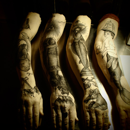
     This chap travels all over the globe producing top quality work of a uniquely stylised standard. His combined use of dotwork and whip shading result in highly texturised and striking tattoos that compliment the dark, macabre subject matter that they depict.
     This, coupled with the three-dimensional nature of the human body on which they are created, breathes an eerie sense of life into what are in fact two-dimensional images.

     I'm a huge fan of his work (and unless you're a square) you should be too..


Tattoo by Rafel Delalande


long day…….
Tattoo by Rafel Delalande

     Check out more of Rafel's work here.

Thursday, 5 December 2013

Website research.

     Next semester I will be crafting my very own proper website, so before then I thought I'd best look at some existing ones and decide what I like about them.

     I began my research by looking in the favourites folder of my browser (for obvious reasons), however, it turned out that almost all of them were simple social network pages; which I think says something about modern society, but isn't much use to me at the minute.

     In the end I turned to the all-powerful and omnipresent overlord "Google" to aid me in my quest for website-based knowledge, and I found some quite interesting examples:

  •      Duncan X's website, duncanx.com, was the first to draw me in. The homepage features a simple, black on white, hand rendered image which gives off an all-round air of simplistic luxury, much like the packaging of fancy, overpriced goods. However, the navigation of the site lets it down. Links are often hard to decipher and occasionally open up new tabs for no real reason.     Aesthetically though, this site is mostly rather pleasing to the old eyeballs due to it's simplicity, which is something I will keep in mind.
  •     Shortly after I was told to check out mrgordo.com. Again it features a simplistic layout but is much easier to navigate as there is a clearly labelled sidebar that takes you where you want to go. Similarly, valtastic.com and thequietrevolution.co.uk employ the use of sidebars as a means of navigation and I think in terms of a website intended to display artwork this works very well, as images are allowed to take centre stage while the boring bits are neatly tucked away but not out of sight.
     I plan to continue picking apart websites as I peruse the internet, but so far the conclusion I've come to is this: keep it simple, keep it pretty.

Friday, 29 November 2013

David Firth.

     Stumbled across this little nugget of inspiration whilst indulging in cartoons on the internet. David Firth (for those who are unfamiliar) makes dark, unsettling and hilarious animations that are quite often based on the nonsensical subject matter and scattered chronology of dreams.

     I've always enjoyed his work but having seen this interview and sneaking a peek into his life and work process like some kind of curtain-twitcher, I've gained a much stronger appreciation of his work and stolen a bit of inspiration.


Go here to view the man's work in all it's splendour.

Wednesday, 27 November 2013

Self-directed Project Update.

     Having spoken to my tutors recently and discussing my work, it has transpired that in order to make some successful work I should concentrate on just producing things that I want to produce rather than overworking images for hours in order to fulfill the brief.
     This was music to my ears and resulted in me getting more done than I have in a long time and enjoying it.

Friday, 22 November 2013

Self-directed Project.

     The clue is in the name: this brief allows me to produce pretty much whatever I want over several weeks. Having being able to relate to the previous brief concerning outsiders, I've decided to stick with the theme but produce a broader spectrum of work pertaining to what society tells us is different from the norm and more specifically how those who are different should revel in it and just be themselves in spite of what the masses might think.
     This is something I've always believed in myself, so naturally I have alot to work with.

Thursday, 7 November 2013

Hopes, Fears and Opportunities.

     During my first two years at uni I got a real mix of briefs that I either could not relate to at all, or eventually found myself being surprisingly interested in. So this year I'm planning to make sure I find an angle to approach each brief, in a way that will definitely interest me and fit with the way I work. In other words; pick briefs that are challenging in terms of the ideas and subject matter involved, rather than because I have to attempt to produce work in a way that is uncharacteristic of my personal work: I enjoy making work in the way I want to make work, and there's no sense in disregarding that.

     Taking this into account, my fears are fairly obvious: If the above issues were not addressed (and I became stuck in the monotony of trying to churn out work that I don't take pride in producing in order to jump through a divergent succession of hoops that are established by a client on a high horse) I feel it is unsettlingly likely that I will lose interest in what I've enjoyed my whole life, turn my back on the dream of making images for a living and 
become the real world equivalent of Seymour Skinner; moving back home with mother and living there until I'm in my late 40's.

     As luck would have it however, this year I have several opportunities to steer myself in the direction of the path I do wish to take: I have more than one self-directed brief I can take advantage of to make work I'm personally interested in, as well as a couple of portfolio visits on which I can meet and receive advice from enwisened and like-minded individuals.


"One day I'll be a beautiful butterfly!" - Heimlich, A Bug's Life.

Wednesday, 6 November 2013

Inside Outsiders.

     I was set a brief recently based on outsiders/ outcasts and Albert Camus' short novel "The Outsider". Here's what I've been up to...

     I wanted to base my work on the image-based code systems used by existing groups of outcasts such as gang/ cult insignia, hobo signs and, of course, the tattoos worn by sailors and criminals. The very thought that an image can be imbued with enough meaning and significance that it can be read like a language to those who are in-the-know appeals to me a great deal, and I've come to realise that it is this quality (along with overall aesthetics) with which I form an opinion on pieces of work.
     This being said, I decided I should create a visual language for a currently under-represented group that could be considered outsiders. Coupling this with the secondary realisation that throughout the course it has been briefs in which I could relate to and have subsequently immersed myself in that have been the most successful, I decided to begin producing imagery that pertained to myself as an outsider.
     Luckily, I suppose, right at the beginning of the new university year I was finally diagnosed with Obsessive Compulsive Disorder and depression which both come with the delightful stigma that is associated with mental health issues, so I had inadvertently been given something with which to work. Groovy.


     The above image is a screenprinted reproduction of a drawing I made. The wee demon chap, whose pose I hope looks somewhat noticeably like a human skull as I intended, represents the presence of OCD within the mind, and the trident he holds represents the intrusive divide between happiness and depression (the sun and moon) that it can cause.


     I also screenprinted the image onto cloth patches that could be sewn onto clothing and worn in the same way as military insignia or scout badges: the idea being that wearing it would signify to others that the wearer had had to experience something in order to "earn" it. Whether or not it was clear to others what said experience consisted of was arbitrary, and being the reserved introvert that I am I decided that when it came to displaying my work (pictured above) I would give no clue as to the meaning behind the images, other than the obvious notions of "being an outsider" that the title of the given brief indicated. Leaving the image open to interpretation by the viewer.


     This is another, less successful, patch I made using a laser printer on leather at Laserlea in Manchester. Having never used or researched laser printing before, I had no real idea of what the final outcome would look like, and I think it's obvious that my work needs some tweaking in order for it to suit the medium better.
     It's hard to make out in the picture, but the design is of a three-eyed human skull (the third eye representing the mind) underneath which is a broken arrow that is meant to signify (would you believe it?!) something that is broken; in this case, the mind.

Tuesday, 30 April 2013

Occult as Inspiration.

A review.


"We like the idea of creating a hidden language, as if we were communicating with other places and dimensions, as if it were our own private religion." - Luke Frost


     I read an article a few months ago (from May 2012) about a growing group of designers that are inspired by the occult. Having forgotten about it, I recently read it again and was pleasantly reminded that I'm not the only one with the belief that a nice sliver of hidden meaning is what makes an illustration worth looking at.

     The article makes endless reference to symbolism and how, by implementing symbols, one can hint at meaning or convey "transcendent realms or experience".
     It is also suggested that the use of said symbolism brings more to the table than simply creating an image: "the occult is additive in its use of imagery. It always offers that little bit more, which you might describe as 'chaos', but in reality, produces an intense, visual indulgence." This seemingly superfluous addition of imagery brings with it further insight into the "meaning" of the piece as a whole. Though these symbols may not necessarily be decipherable to the viewer, the mere fact that they are present alludes to an 'unwritten', unknown subtext giving the image a sense of depth and integrity that provides a powerful spark of intrigue 


     This fusion of integrated yet separate elements within illustration is described as being the descendant of collage; a medium in which narrative and message can be created simply by juxtaposing two elements: 
"as if images placed side-by-side point to some new, unconsidered history." This notion of creating something entirely new from preexisting elements is of course reminiscent of alchemy; where magic and science convene to question the limits of mother nature to the point of breaking. 

      For me, this article sums up everything I love about illustration, imagery and art as a whole. The ability to capture that which is ethereal in nature, to allude to the auratic and mysterious by making the viewer pose query and search for the concealed, is something I am keen to explore within my own practice.

1,2,3.. Advice.

     Back in November, Charlie and I had ourselves an arduous adventure to the idyllic little town of "Lon-don" to (among other things) visit our favourite illustrator/ tattooer at The Circle Tattoo Studio in Soho. Despite being too busy trying to pretend that I wasn't in pain to ask the questions I'd thought of in advance, most of the answers naturally cropped up in conversation.
     Of all that was discussed, one thing in particular stuck in my mind: 
'Keep going in and just ask loads of questions. Be annoying.'. 
     Though this was originally said in the context of pursuing a career as a tattooer (which is something I am definitely interested in) I feel it can be applied to life in general. If there's something you're interested in or passionate about; pursue it. Find out all you can about it and don't be afraid to pose questions.

     Over the course of the year, usually as one brief ends and another begins, one piece of advice has been given to me from multiple sources, time and time again: 
"Just go for it!".
     I've heard this so often in fact, that it has become a sort of mantra for approaching each new body of work. My working practice is usually rather labour intensive and tedious, with hours upon hours of work put in to even the smallest of drawings. So meticulous is my approach, that I  would often dive straight in to producing a finalised piece of work rather than taking the time to experiment with and jot down ideas that would be better than or an improvement to the outcome. Since being told to "just go for it", I've found myself being more loose in my approach to work; I'll often sketch out and experiment with smaller versions of a bigger piece without giving in to the compulsion to render each one into a "finished" piece.

     Given the almost identical nature of these two quotes, it would be almost rude to not include another that has a similar gist.
     After recently purchasing and listening to some new records I came across a song that left me feeling unnaturally motivated to go after the things in life that I wanted. I'm not going to sit and type out the whole thing but the song is titled "Keep On Keepin' On" by Seasick Steve, which I'm sure will give you some idea as to the message in it.

The Mark of Cain.

A documentary on Russian criminal tattoos.

     Having been interested in the cultural traditions of tattoos for a while, I found this documentary immensely interesting. It is filmed on location in several notorious and incredibly overcrowded prisons in Russia, involving interviews with guards and prisoners alike.

     The film documents the vast and complex visual code that was commonplace within the Russian penitentiaries up until the late 80's. Criminals during this time, would wear tattoos so that others could determine their rank within the prison. These would consist of tattoos signifying past crimes and the nature of their sentences, number of sentences (including time served for each), drug addictions and their outlook; such as a willingness to kill for pay and a disregard towards authority.

     This system of tattoos reflected an undertone of honour amongst the convicts. For example should an inmate acquire a tattoo that he was undeserving of, he would be beaten and have it removed by cutting off the skin.

     Although tattoos and the system in which they are earned, applied and understood is the main focal point of the film, it also gives insight into the bleak lives that these men and women are forced to lead. The way in which interviews are conducted and the unbiased approach to the information that is presented has a poignancy that resonates so fervently that you are left with a sense of unanticipated empathy, and indeed even respect, for some of Russia's most violent and hardened outlaws.

Saturday, 27 April 2013

I wish I'd done this.

     Combining tattoo traditions from across the globe, Guy Le Tatooer is without doubt a veritable pioneer; through his own artistic pilgrimage to perfect his own timeless style he is pushing the boundaries of the medium and taking it to new and unexplored places.


Guy Le Tatooer - Tattooed arms, 2012


     In mid 2012, on the walls of Paris' Gimpel & Muller gallery, hung a series of box-frames. Within these frames were arms, reproduced in the unsettlingly realistic medium of silicon which had then been graced with the privilege of having tattooed upon them the unmistakable modern twist of folkloric imagery that is Guy Le Tatooer.

     The arms themselves are reminiscent of the animals and body parts preserved in formaldehyde in days of yore and bring with them the macabre aesthetics and morbid intrigue of specimen jars. Coupled with tattoo (a medium which has fluctuated in terms of class association over the past hundred years between valiant monarchs and thuggish peasants) these works, grouped together as a body of work, give off an air of forbidden interest, and from within the walls of the gallery, present this long standing taboo as if it were any other high art.

     The work exhibited was a study of how images "fit" the body. How they flow with the contours of the human form. As well as this, within the context of the gallery, Tatooer was providing a literal and undeniable interpretation of the tattoo as art.
     The composition and placement of tattoos and how they interact among each other when placed on the human body is something that interests me greatly. Carried out properly it can enhance a tattoo to beyond mere imagery and propel it on into something more. It is in itself a feat and through Tatooer's exhibition, can be truly appreciated.

Monday, 4 February 2013

Liam Sparkes.


Liam Sparkes - Illustrator, Tattooer, Moustache Grower.

     I only discovered this man's work a few weeks ago, but I love it, and after watching a short interview he'd done I quickly decided I want to be just like him when I grow up.
     As well as being the proud owner of a fine moustache and rad collection of tattoos, he also started out as an illustrator, making various bits of artwork for flyers, t-shirts bands etc. before moving on to a more rewarding career as a tattooer.

Liam Sparkes


Liam Sparkes

     If you like his work, which if you have functioning eyeballs I'm sure you do, you should either buy some prints of it or go meet him and get some of it tattooed onto you.
     Alternatively you can go here to browse some photos of his work.


     I imagine influence of his work will slowly rear it's head in my own.

Into the Darkness.

     I've really been getting back into drawing recently. I never went off it exactly, but the whole notion of "thinking with a pen in your hand" (or in it's proper Latin form "messing about") has really made me enjoy it a whole bunch more, even though the outcomes aren't exactly brilliant or something you'd mention to your penpal.
     I could rant on about all the influences I've discovered or been recommended recently but I'll save that for later. Instead, here's some of what I've been birthing into existence with my mind and hands:


Sketchbook work for "The Wind in the Willows" brief + mess.


Sketchbook work for "The Wind in the Willows" brief (details).


     These silhouettes aren't finished yet but I actually quite like them as they are. I've been experimenting with solid black/ shadow more in my recent work (as is also evident in my personal work below) and the feel it brings to the table.
     I've also been contemplating the personality of each character and how to portray it without turning them into mutant humanoid clichés  It occurred to me, while in accidental attendance at a strangers houseparty a few days ago, that objects, clothing and specifically eyewear can say alot about you. Judging people based on their appearance/ how they dress is actually incredibly useful and often fairly accurate because of the connotations that items have acquired throughout history, so I do it all the time.
     Above I've given each character eyewear (sort of) that I feel sums up, or at least hints at their general character. If you're wondering what they're meant to be then behold: half-rimmed specs, telescope, monocle, sleep mask.


Awful photograph of a squid I drew.


Similarly awful photograph of a gnarled prehistoric fish I drew.


Party of One i.e. A Fox in a Party-hat.


     Obviously none of these creatures are characters from the book, they're just bits of recent personal work. However, since they've been going on along side this brief they do incorporate some of the traits I've been messing with; namely light and dark but I have also been looking at having more than just one stand-alone element within my work.
     I am definitely going to stick mostly with single elements because it's how I love to work, but it's nice to be able to incorporate others if I have to.

Friday, 1 February 2013

By the power of Greyskull!

and constructive criticism!


     Today, with my hands, I put the final touches on my Age UK work and then, with a computer and the aid of somebody else's hands, neatened it all up a bit. I'm actually quite pleased with how it turned out in the end which is mainly down to a group crit I was a part of. I usually feel like I don't get anything from them other than more work to do but this time something clicked; I got helpful/ insightful feedback and by paying attention to it was able to improve my work. Awesome.
     Here it is anyway, in all it's digital glory:


You Know Nothing - Inspired by the life of Wilf.

Wednesday, 23 January 2013

Kelly Clarkson's Handbag.

     Another new year, another new brief. Got to design a cover for a book that most people have at least vague knowledge of: The Wind in the Willows.
     Personally, I've never read the thing, but I'm fairly certain it's about animals and their shenanigans so it should be fun.
     Gonna pull my finger out for this project, Lord only knows where from.


Freshly picked, organic sketchbooks.

     I want to avoid the whole animal's prancing about in tweed and slippers thing and focus on the slightly darker side of things because I think I'd go mental otherwise. At the minute I'm just drawing critters and messing about a bit though. Happy, happy, joy, joy.